
In boardroom discussions and strategy meetings across the region, I frequently encounter a prevailing—and frankly, dangerous—myth among non-designers. Many well-meaning clients, founders, and even seasoned executives have somehow convinced themselves that graphic and packaging design is “easy.” In the age of generative AI, the refrain from the C-suite is almost predictable: “Why pay a design agency when we can just prompt an AI to create our packaging?”
This mindset reveals a fundamental misunderstanding of commercial print production. I had been an Apple Mac DTP (desktop publishing) pioneer and evangelist in the 1980s, and I knew quite a bit not just about graphic design, but also what goes into print and multimedia production. While even many graphic designers generated huge design files that crashed at the color separation stage, I could optimize images and designs right down to sleek and small files that could easily get printed.
AI “art” versus vector ART
Yes, a generative AI tool can conjure stunning, hyper-realistic color photographs or intricate digital paintings in mere seconds. But here is the harsh technical reality: AI models generate low-resolution bitmapped (raster) images. A bitmap is essentially a fixed mosaic of pixels. To the uninitiated, AI-generated designs might look great on your smartphones or even your monitors, but when you try to enlarge it to an A3 poster or onto a box design, you might end up with something blurry and unsavory. Remember, NEVER believe this silly idea of “we can fix it in post.”
Commercial packaging and industrial-grade designs demand editable vector art. Unlike bitmap images, vectors are not made of fixed pixels but are defined with math equations. This allows a vector logo or typography element to be scaled infinitely from a tiny lip balm tube to a highway billboard without losing a fraction of sharpness, all while keeping file sizes incredibly small and manageable for commercial printers. At the same time, they are more easily manipulated and tweaked by moving data points and curves, unlike bitmapped images. Relying on an AI-generated JPEG for your Go-To-Market (GTM) strategy is a fast track to amateurish, unprintable packaging.
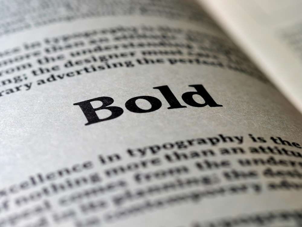
If AI bitmaps and complex color photographs are a technical and financial trap, what is the smartest path forward? The answer is minimalist packaging design anchored by Good Typography.
When you strip away the crutch of elaborate photographic imagery, you are forced to communicate your brand’s essence through pure design elements: space, structure, and type. Here is why prioritizing typography over photography is the most strategic, cost-friendly GTM approach for any consumer brand today.
1. The Economics of Printing
Printing a full-color gradated image goes through a four-color process (cyan, magenta, yellow, and black, or CMYK for short). Such processes incurs costs for plates, inks, and meticulous quality control to ensure color registration doesn’t “bleed” or basically become blurry.
Conversely, typography-based designs can often be executed using just one or two spot colors. This drastically reduces printing costs at scale. When you are launching a new product and managing tight GTM budgets, saving on packaging production without sacrificing aesthetics is already an operational win.
2. Instant Recognition and Shelf Impact
Walk down any supermarket aisle, and you will face a wall of visual noise—packaging screaming with bright photos, chaotic gradients, and cluttered graphics. Human psychology dictates that the eye is naturally drawn to negative space. A minimalist package utilizing a beautifully kerned, distinctive typeface cuts through the clutter. It projects confidence. It tells the consumer, “Our product is so good, we don’t need a flashy picture to sell it to you.”
3. Agility and Scalability
A typographical design system scales seamlessly across an entire product portfolio. If you need to launch a new flavor or variant, updating a vector text file takes minutes. Trying to generate or shoot a new color photograph that perfectly matches the lighting and style of your previous products is an expensive, time-consuming nightmare.
Let’s look at how this minimalist philosophy plays out across the Fast-Moving Consumer Goods (FMCG) spectrum through some practical illustrations.
Consumables (Personal Care)
Think of an organic skincare serum. A busy label crowded with pictures of aloe vera leaves and lavender sprigs looks cheap and cluttered. A minimalist frosted glass dropper bottle featuring only a delicate, widely-spaced typographic layout against a pastel spot color background instantly exudes sophistication.
Electronics
Consider the packaging for high-end wireless earbuds. Brands that rely on glossy, full-color photos of the product often find the box looks dated within months as hardware trends shift. A minimalist GTM strategy uses a rigid, pristine white box with the brand’s logo and the product name debossed in a clean, modern geometric font. It feels like opening a piece of timeless luxury, not a disposable gadget.
Food & Beverage (F&B)
Imagine a new line of artisanal cold-brew coffees. One approach uses a complex, multi-colored photograph of coffee beans splashing into water. The smarter, minimalist approach uses a clean, unbleached textured paper label. The brand name is set in an elegant, custom serif font, with a single, bold spot-color (like a deep ochre or forest green) used only for the variant name. It stands out precisely because it isn’t competing in the visual shouting match.
Health Supplements
Picture a premium nootropic brain supplement. Instead of a generic stock photo of a glowing brain or a low-resolution AI-generated meditating figure, the bottle relies on a stark, matte black label. The only visual is the product name and associated brand set in a bold, sans-serif, silver-foil typeface, with precise, grid-aligned functions or benefits below. It instantly communicates clinical efficacy, premium quality, and scientific transparency.
Minimalist design and the human way
Successful branding is not about showing the customer every possible detail through a photograph or some generated image. It is about evoking a positive feeling and building trust. Generative AI is a fascinating tool for brainstorming or perhaps concept creation, but it is not a substitute for the truly artistic and polished designs or the meticulous, highly technical craft of packaging design. By investing in the best human talents that comprehend and mastered minimalist design and impeccable typography, brands can achieve a consistent, premium, and cost-effective market presence that endures far beyond the latest tech hype cycle.
###

Dr Seamus Phan – Global C-suite Publicist & Strategist (Biochemist, Cybersecurity & Webdev pioneer, Author, Journalist) with nearly 40 years of professional field experience.